Guide
What is the Search Console traffic simulator?
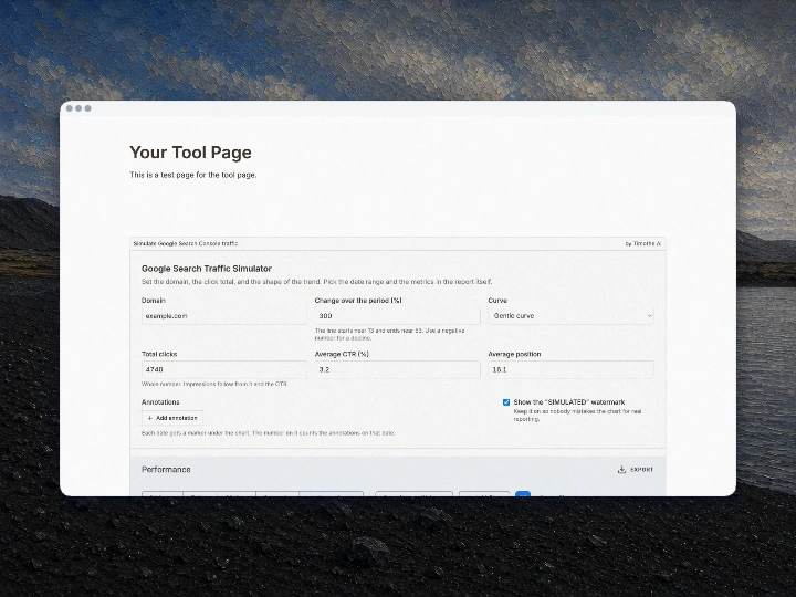
The Search Console traffic simulator draws an invented performance report in the style of Google Search Console: four metric tiles, a daily chart, and tables of top queries and pages. You choose the shape of the story, the tool generates every number behind it, and the result is ready to screenshot.
When it comes in handy
- Illustrating what a growth curve looks like in a talk, a course, or a client explainer, without exposing a real property's data.
- Filling a slide, a landing page mock-up, or a portfolio placeholder with a chart that reads as familiar at a glance.
- Checking how a report screenshot crops and compresses on social media before you have real data to show.
- Posting the joke version: the absurd hockey stick everyone recognizes, watermarked so nobody reads it as a result.
How to use
- Enter the domain that should appear as the property.
- Enter the change over the period. +300% ends four times higher than it started, -60% ends at 40% of it, and 0% stays flat. The field tells you the level the line starts from, so you can aim at the before and after you have in mind.
- Pick the curve: a straight line, a gentle bend, or a hockey stick that saves the move for the end.
- Press the dice button next to the seed until the shape of the chart and the rows of the tables look right. It never moves the totals, so the numbers you typed stay where they are.
- Fill in the three numbers the tiles report: the total clicks, the average CTR, and the average position. Impressions follow from the clicks and the CTR.
- Pick the date range in the report's own chips, from 24 hours to 16 months. The 24 hour view switches to hourly buckets and dots the hours that are still filling up.
- Click the metric tiles to choose which lines the chart plots and which columns the table shows, then move between queries, pages, countries, devices, and search appearance.
- Add an annotation on any date you want to call out. Each date gets one marker under the chart, and the number on it counts the annotations on that date.
- Leave the watermark on, then screenshot the report.
Notes
- Everything is invented. The tool has no connection to Google, to a Search Console account, or to any analytics data, so a real domain still produces made-up numbers.
- The daily clicks always add up to the number you entered, and the CTR and position tiles land on the values you typed. Impressions are simply the clicks divided by the CTR.
- The daily line is deliberately untidy: a weekend dip whose depth changes from week to week, slow multi-week swells, and the occasional spike or bad day. Real reports do not trace the same week over and over.
- The same settings always redraw the same report, because the generator is seeded from your inputs. Change one digit to get a different shape. The seed field is part of that seed too, so rerolling it is the quickest way to get a different looking week without touching the numbers you typed.
- Keep the watermark on when the image will travel outside its context. Presenting a generated chart as your own reporting is misrepresentation.
- To mock up how a page looks in the search results instead, use Preview Google search results.